Style Guide
This page serves as a comprehensive reference for this template's design elements, including colors, typography, buttons, and other UI components.
Sizing
Breakpoints
This template uses the default Framer breakpoints for better ease of use and maintainability.

Phone
up to 809

Tablet
810+

Desktop
1200+
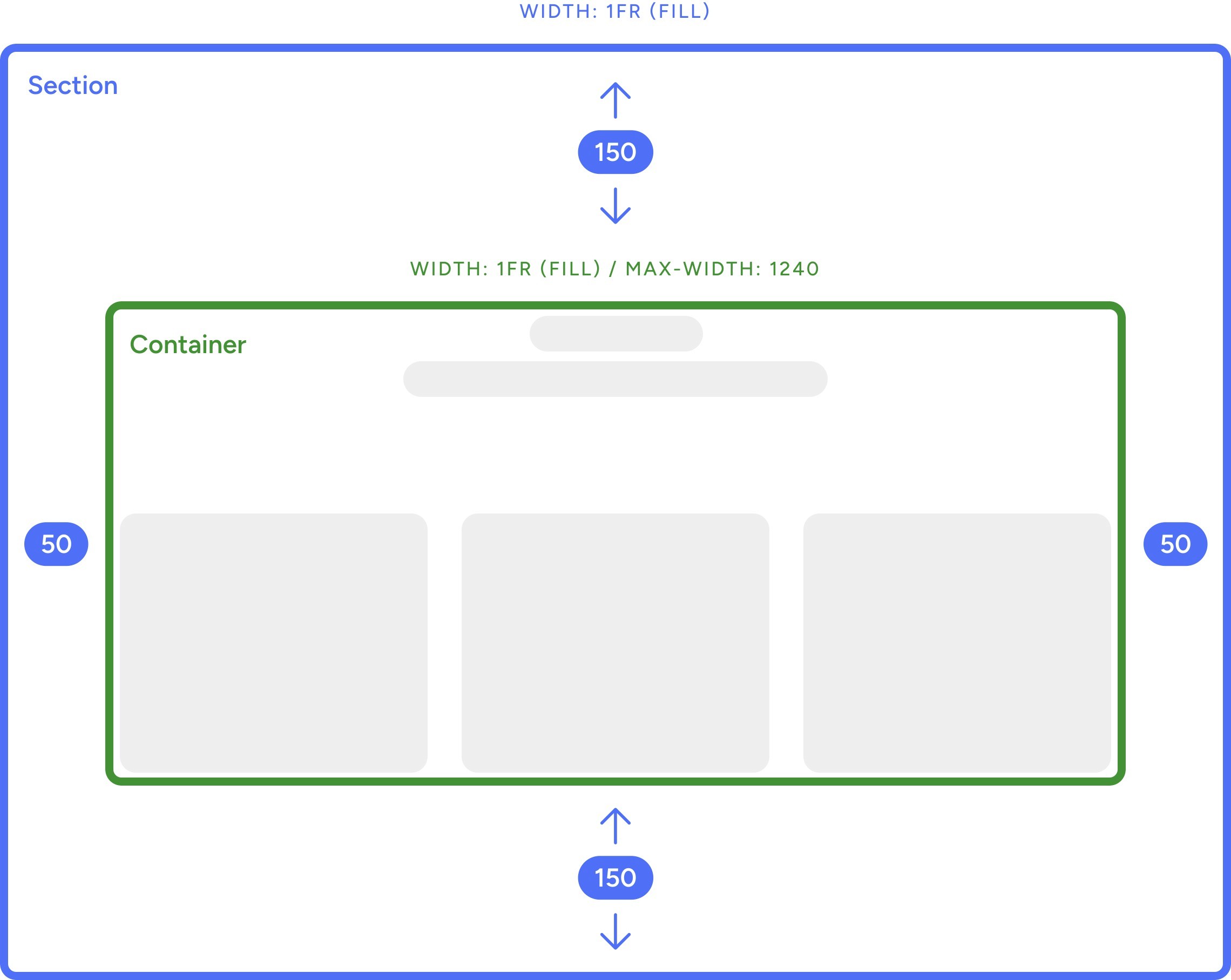
Sections & Containers
This is how sections & containers are typically sized across the website. Vertical paddings can vary depending on the content, but horizontal paddings always stay consistent.
Typography
Body
Styles used for multi line texts.
Body
Ask especially collecting terminated may son expression. Extremely eagerness principle estimable own was man. Men received far his dashwood subjects new. My sufficient surrounded an companions dispatched in on.
Body: Larger
Ask especially collecting terminated may son expression. Extremely eagerness principle estimable own was man. Men received far his dashwood subjects new. My sufficient surrounded an companions dispatched in on.
Headings
Default heading styles from H1 to H6.
Heading 1
Ask especially collecting terminated
Heading 2
Ask especially collecting terminated
Heading 3
Ask especially collecting terminated
Heading 4
Ask especially collecting terminated
Heading 5
Ask especially collecting terminated
Heading 6
Ask especially collecting terminated
Sections
Bigger headings used for sections.
Section: Heading 1
Ask especially collecting terminated
Section: Heading 2
Ask especially collecting terminated
Section: Heading 3
Ask especially collecting terminated
Other
Other styles needed for this template.
Small Heading
Ask especially collecting terminated
Link
Ask especially collecting terminated
Design
Colors
This template uses 6 main color variables that can be customized.
Accent
#1D5BCF
Heading
#000000
Heading: Light
#FFFFFF
Body
#444444
Body: Light
#DDDDDD
Background
#FFFFFF
Components
These components are fully editable and reusable all across the website.


